Case Study: Grump & Sunshine Bookshop Limited Edition Book Series
Overview
The Grump & Sunshine Bookshop limited edition series was created in collaboration with Cassidy James Taylor with the goal of bringing beautifully illustrated, collectible romance editions to life.
From the start, our focus was on building a signature design system with a consistent frame and layout that could carry across multiple books while featuring unique illustrated items and symbols drawn from each story. This approach allows every edition to feel connected as part of the same world, yet distinct enough to reflect its individual characters and tone.
Each design blends rich color palettes, meaningful motifs, and detailed illustration work to create special editions that feel as personal as the stories themselves.
What I Designed
Each book in the Grump & Sunshine Limited Edition Series was created as a multi-element design project, blending illustration and layout work to craft a cohesive collector’s experience.
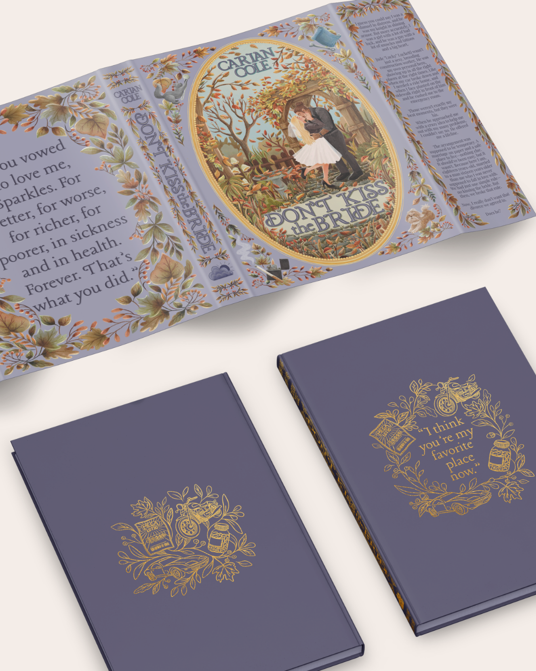
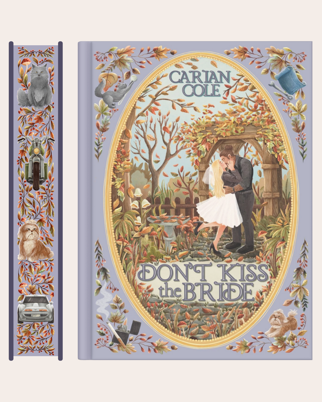
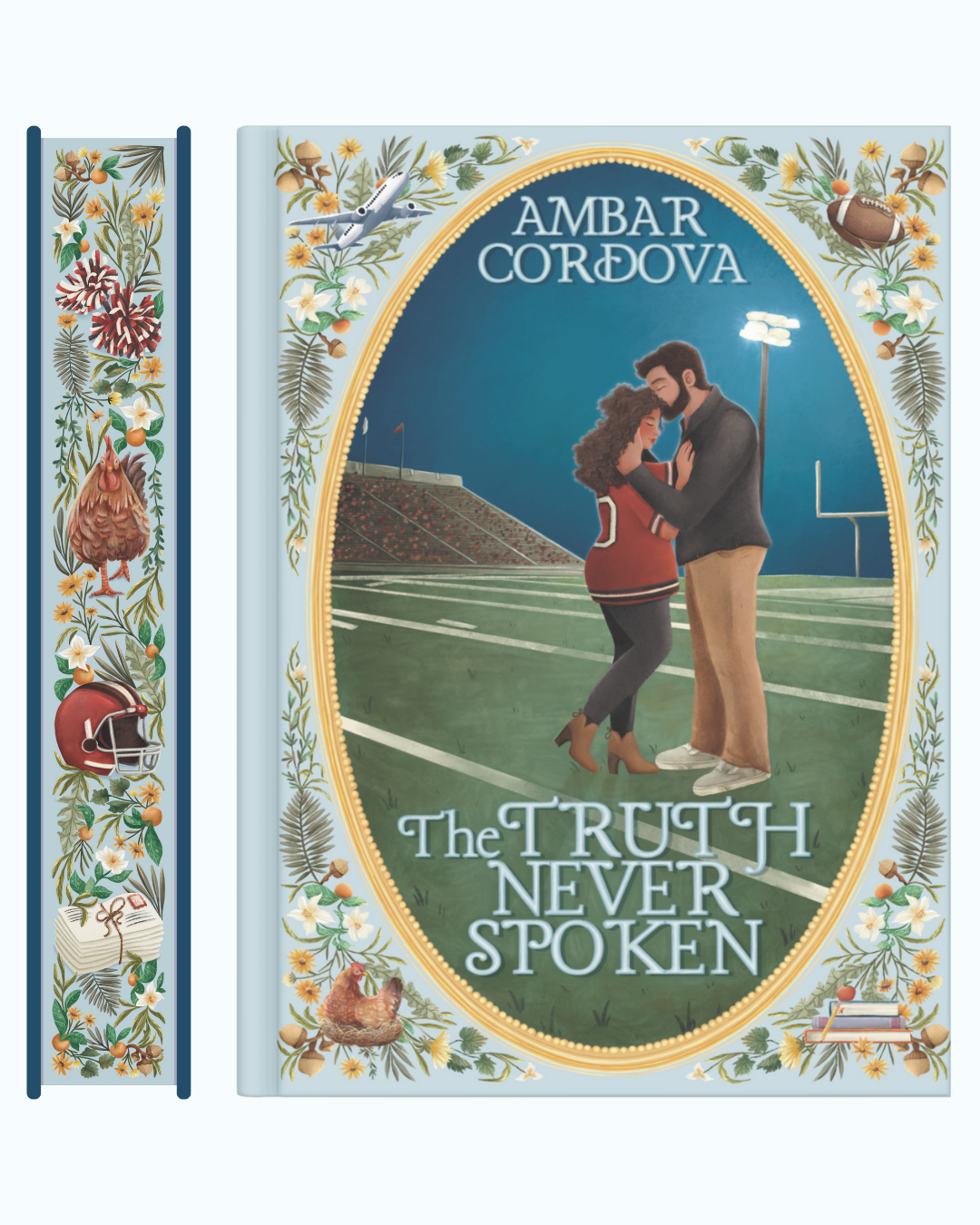
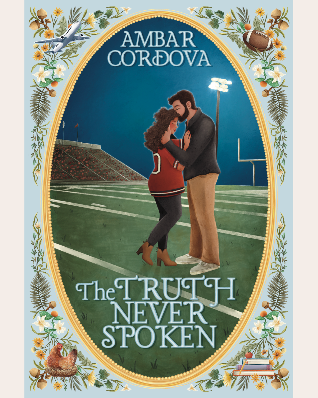
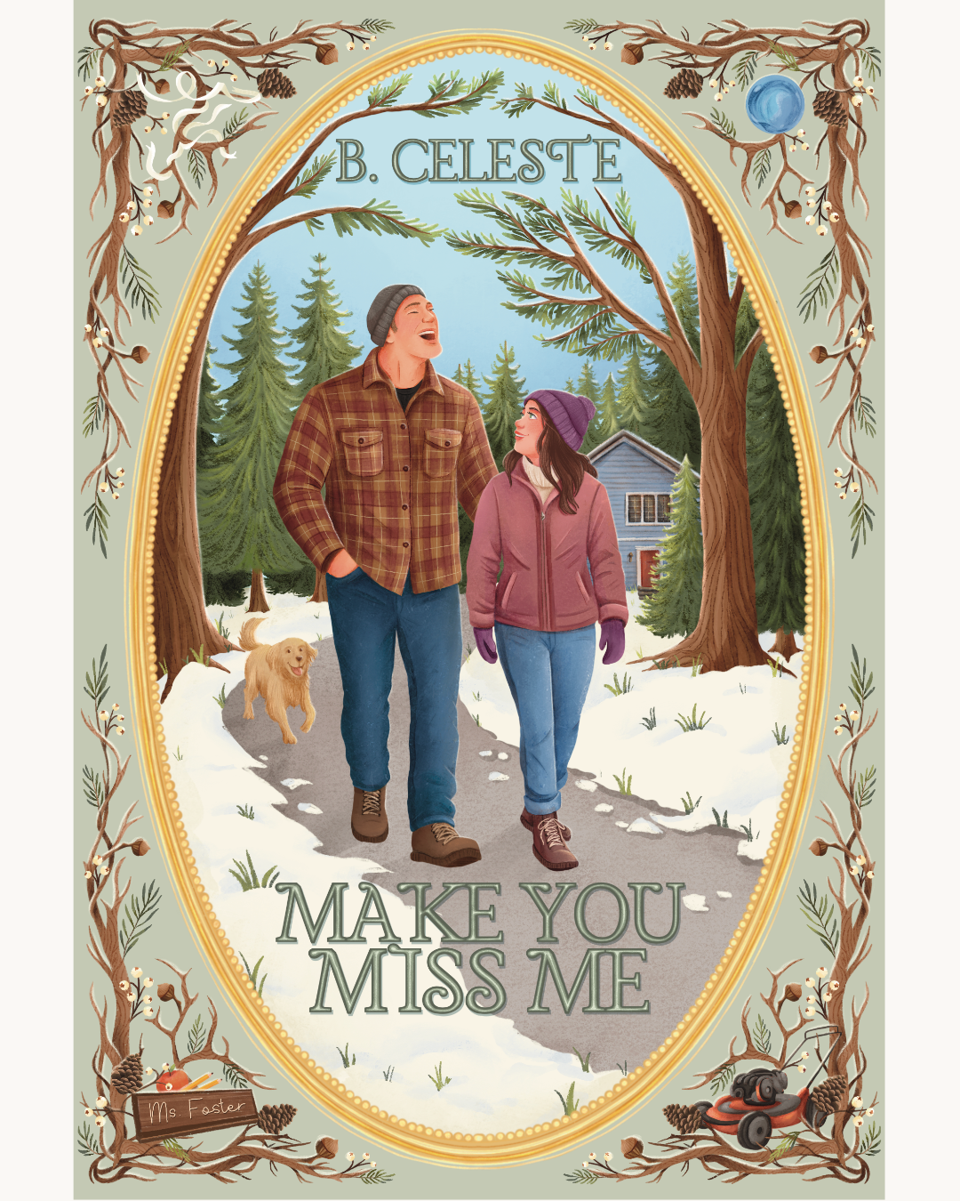
Illustrated Dust Jacket
A fully illustrated Dust Jacket cover that captures the characters, setting, and symbolic story elements all tied together in a romantic, whimsical style.
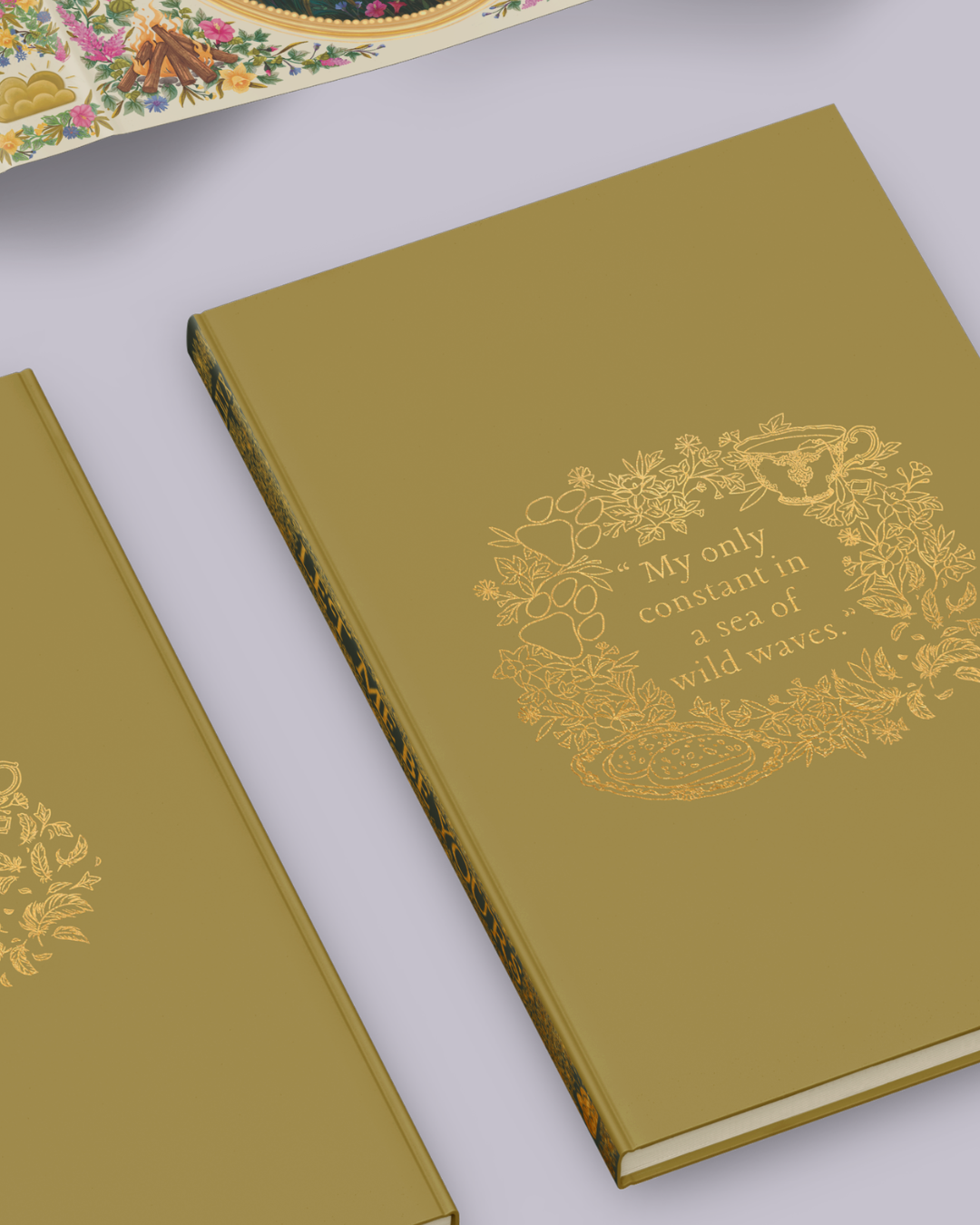
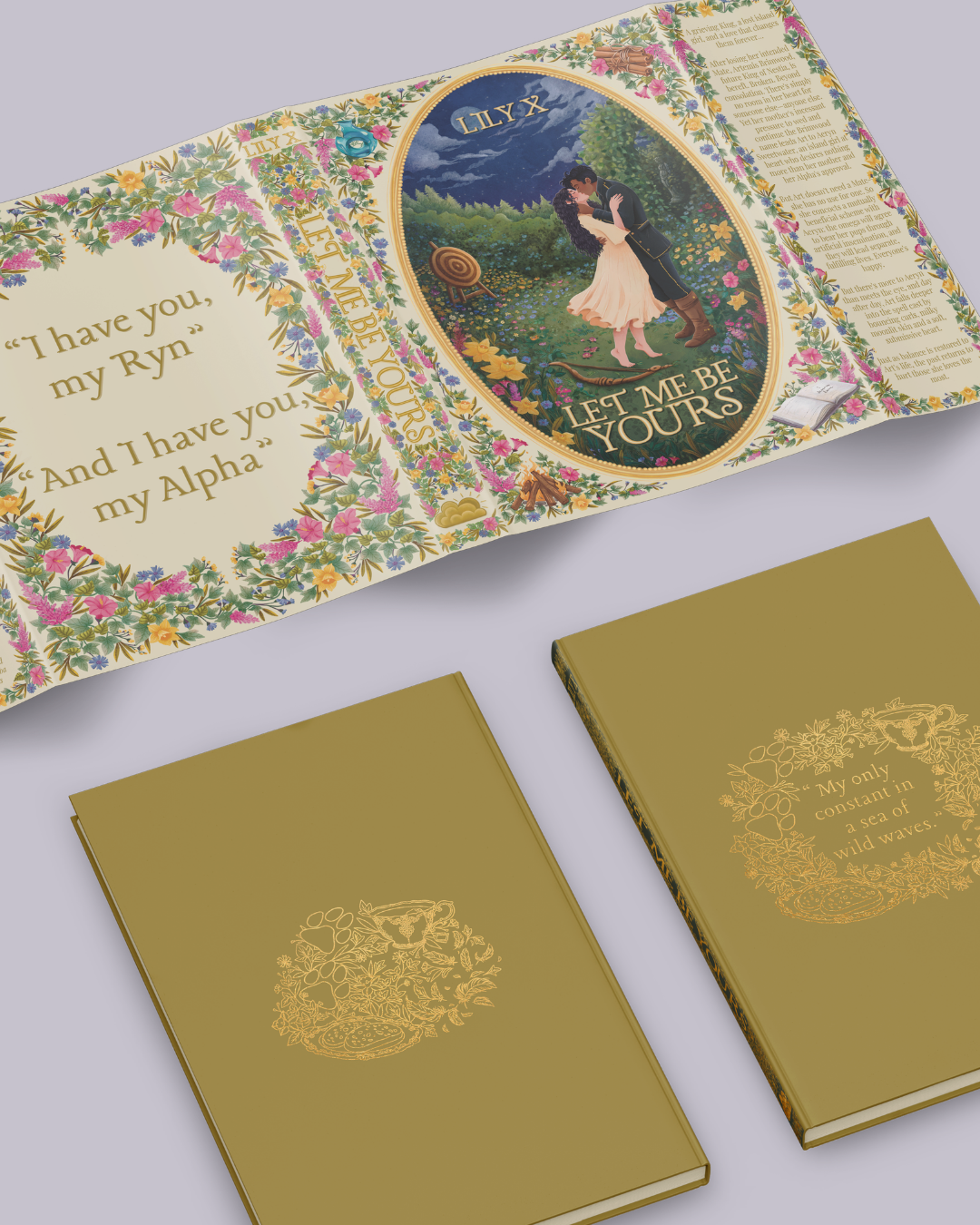
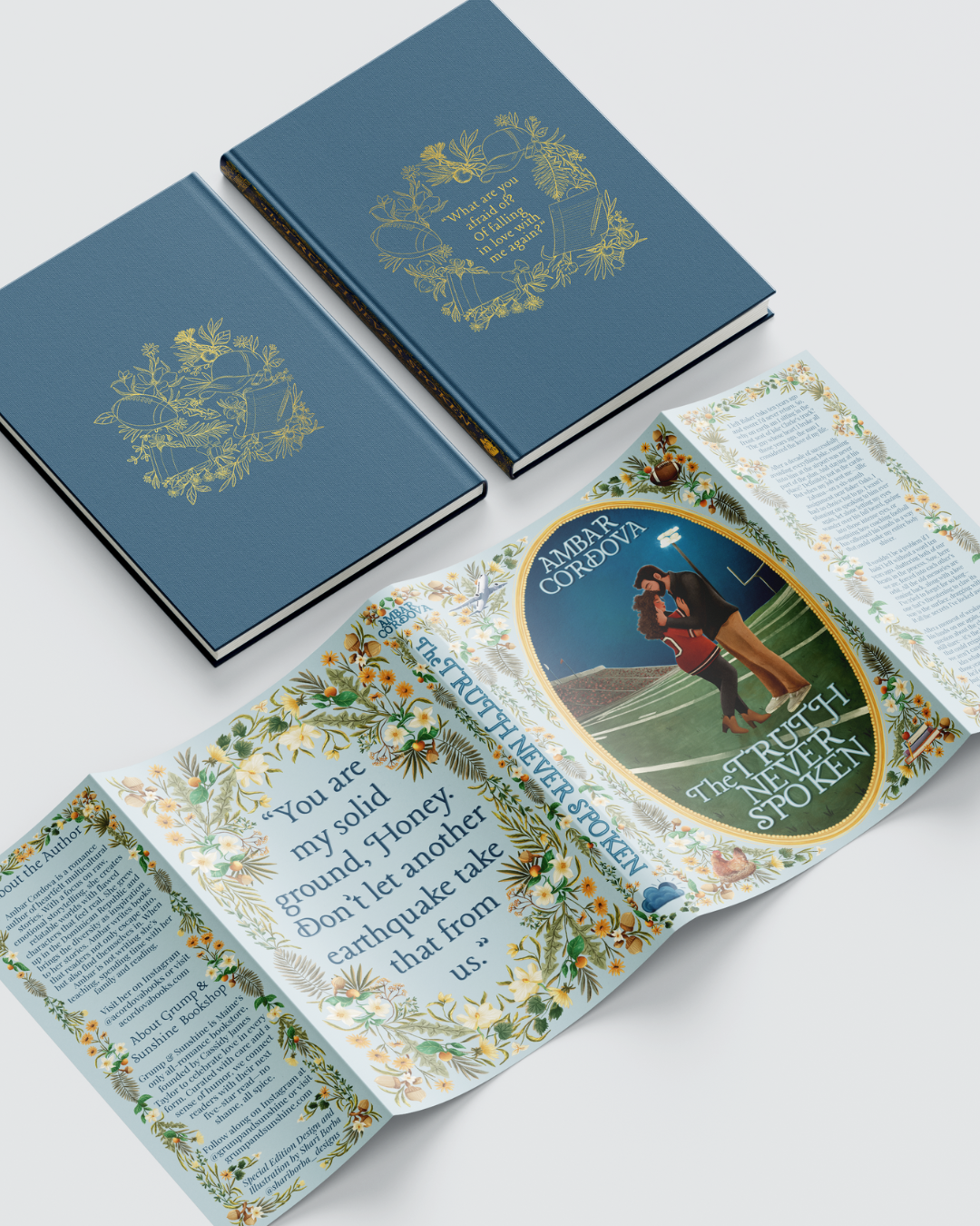
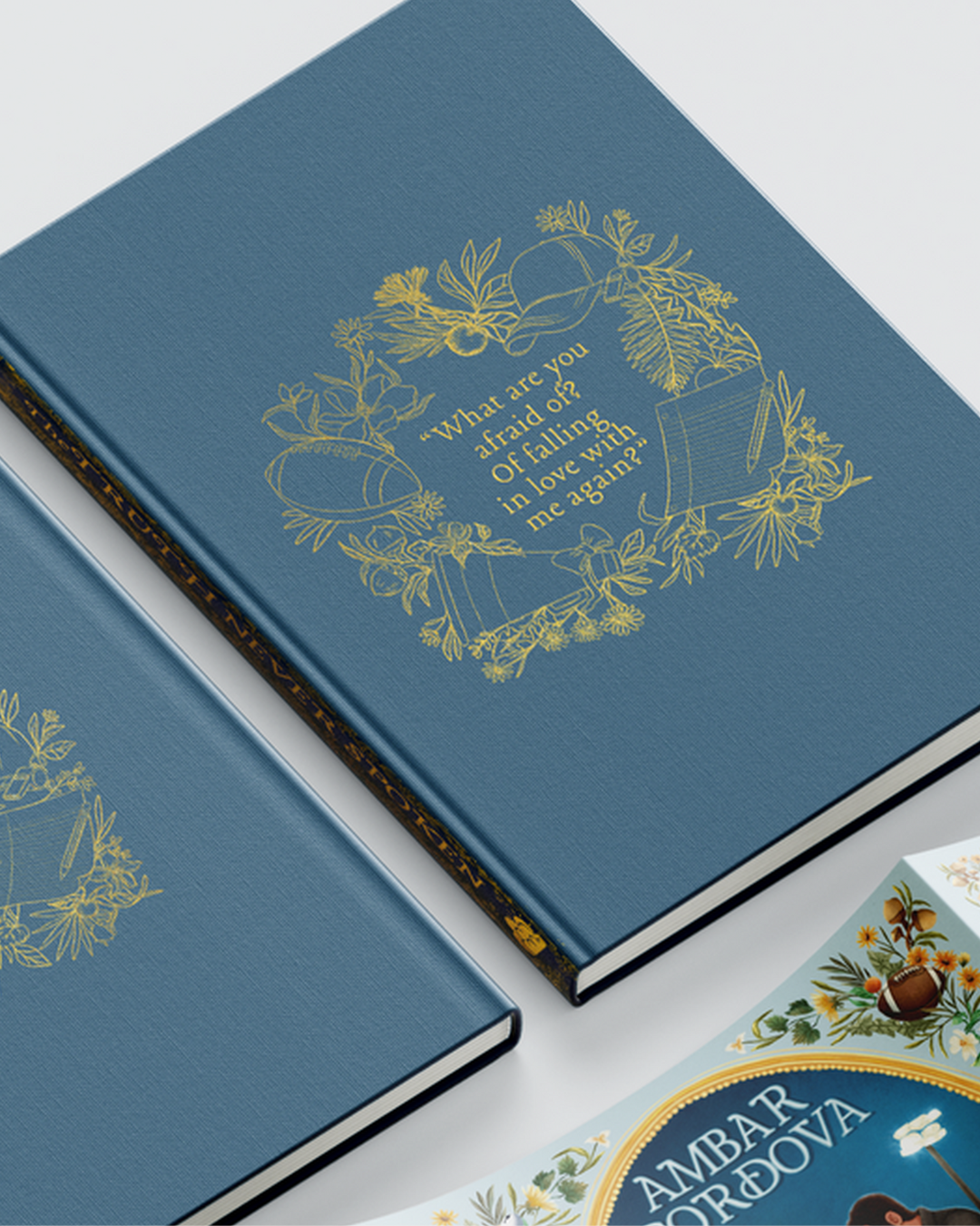
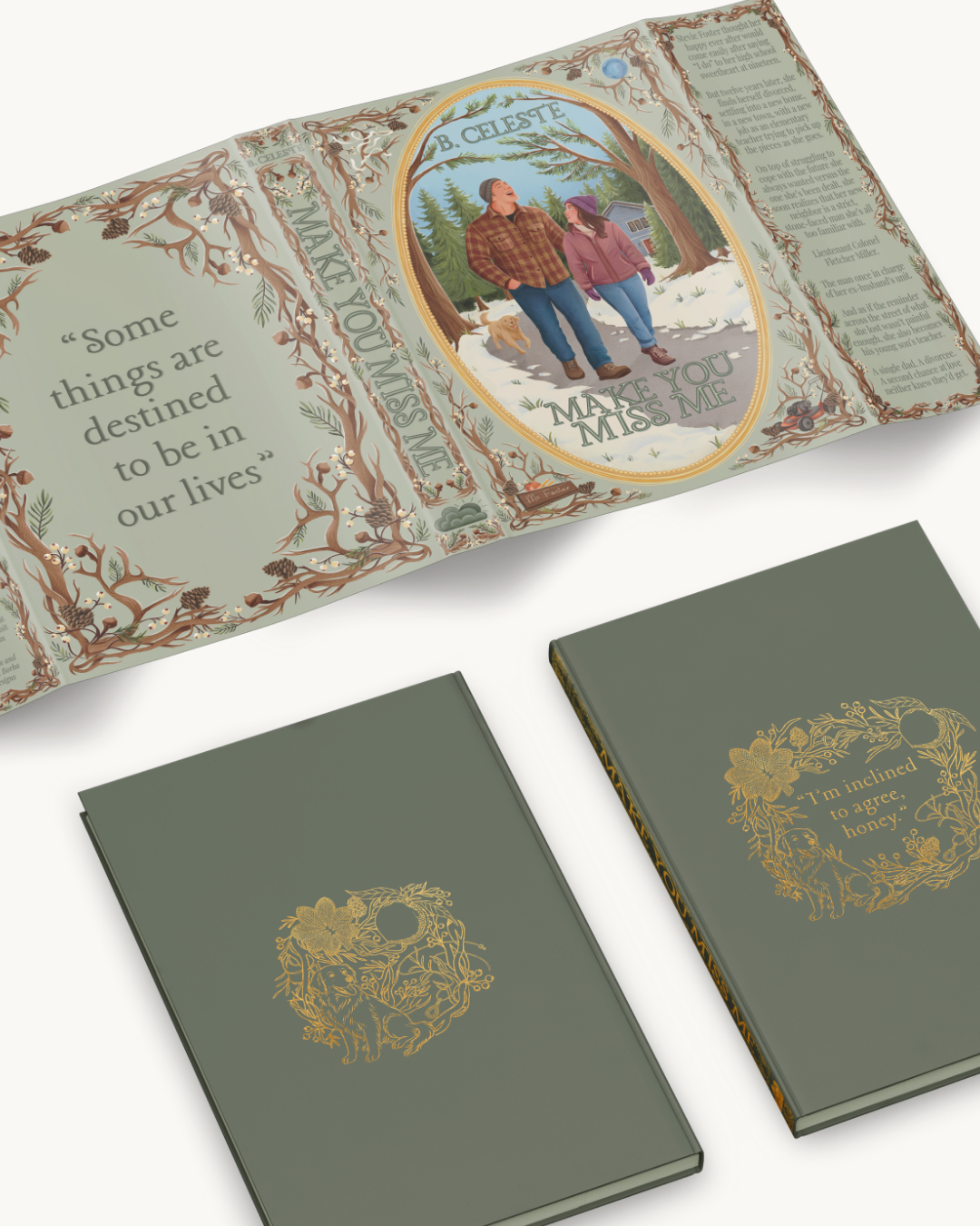
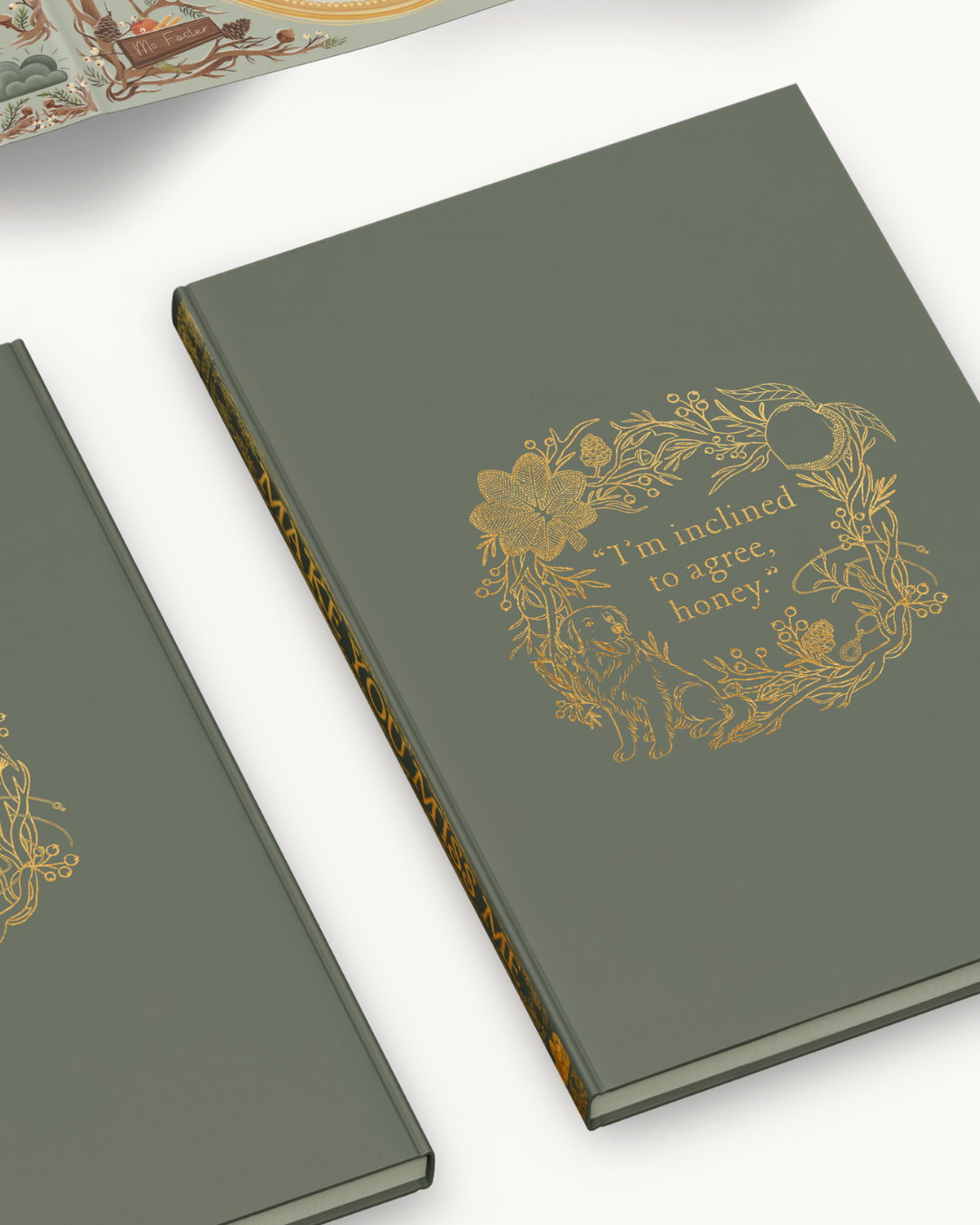
Foil-Ready Hardcover Case
A detailed line-work design featuring a quote, foliage, and curated items from the story, carefully arranged for single-color foil printing.
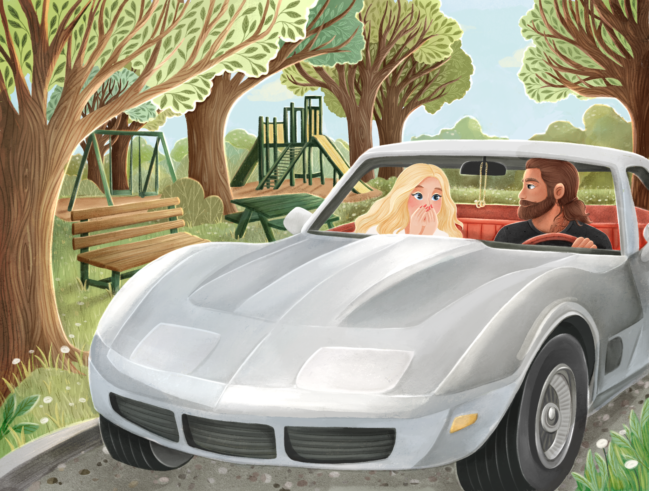
Sprayed Edge Design
A narrative-driven illustration that wraps the book’s outer edges, highlighting character-specific items extending the storytelling beyond the cover.
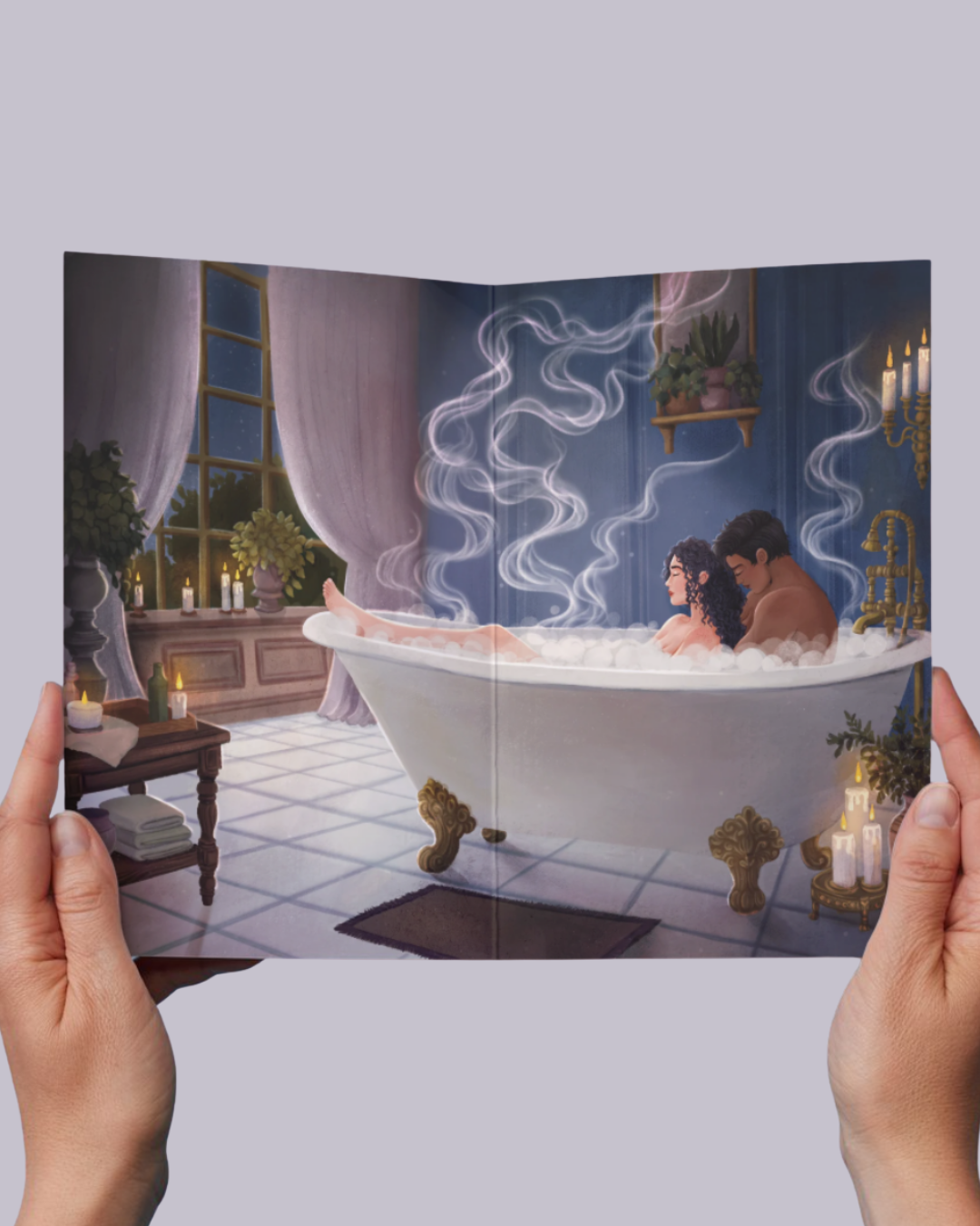
Endpapers
A full-spread interior scene illustrating a key moment for the characters, designed to place readers directly inside the story through layered visual storytelling.
Chapter Header Icons
A custom set of grayscale icons representing recurring motifs and themes from the novel, used to bring subtle continuity throughout the interior pages.
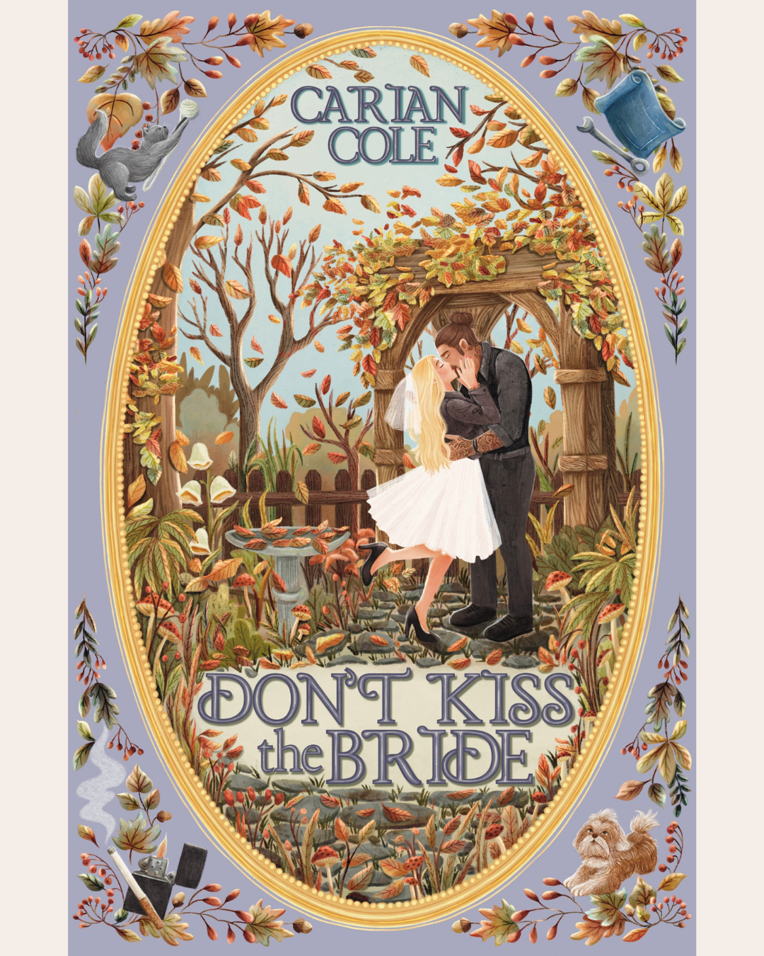
Book 1: Don’t Kiss the Bride by Carian Cole
Creative Direction
The design for Don’t Kiss the Bride set the visual tone for the entire series. The goal was to capture the emotional depth and quiet intimacy of the story through a blend of realism and symbolism. Soft purples and warm neutrals give the edition a nostalgic, romantic atmosphere, while illustrated elements like the Corvette, motorcycle, and prescription bottle tie directly to the novel’s themes of love, resilience, and healing.
Highlights
Established the signature frame layout and item-based composition that continues through the series.
Introduced the single-color foil case style and narrative sprayed edge format.
Balanced warmth and melancholy through both palette and composition.

Client Feedback
“I’m genuinely obsessed with how beautiful this edition turned out. You brought everything I imagined to life—and then some.”
— Cassidy James Taylor, Grump & Sunshine Bookshop
Book 2: Truth Never Spoken by Ambar Cordova
Creative Direction: For Truth Never Spoken, the design evolved to reflect a story rooted in reflection and renewal. The palette shifts to cooler tones, soft blues, muted golds, and touches of light, to create a calm, introspective feel. The illustrated objects expand the series’ visual vocabulary, introducing new textures and motifs while maintaining the familiar frame and foil placement established with Book 1.
Highlights
Expanded environmental depth within the illustrated frame for a more immersive design.
Developed a new color palette that complements Book 1 of the Series while feeling distinct.
Continued the cohesive visual storytelling across jacket, foil case, and edges.

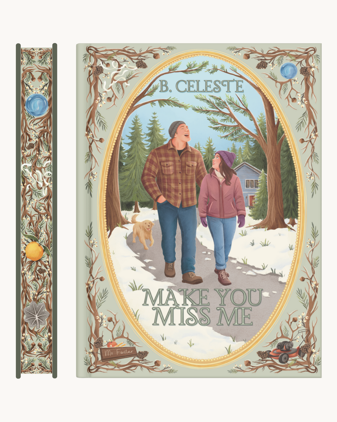
Book 3: Make You Miss Me by B. Celeste
Creative Direction: For Make You Miss Me, the design expands the series’ emotional palette to convey longing, memory, and quiet devotion. The visual language leans into earthy greens, muted creams, and warm accents to create a grounded, intimate feel that reflects the story’s heart. Natural motifs and organic forms are woven into the established frame, balancing continuity with growth in the series identity.
Illustrated objects and symbolic elements extend the narrative vocabulary, reinforcing both personal themes and the series’ cohesive visual story across jacket, foil case, endpapers, and sprayed edges.
Highlights
Expanded the visual symbolism with natural motifs that reflect emotional resonance.
Introduced an earth-toned palette that complements prior books while signaling narrative evolution.
Maintained cohesive storytelling across jacket, foil case, endpapers, and sprayed edges to reinforce the limited edition’s unified identity.
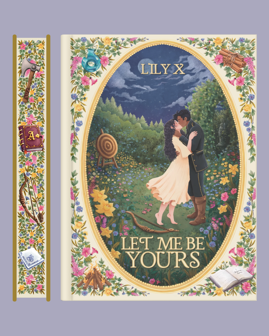
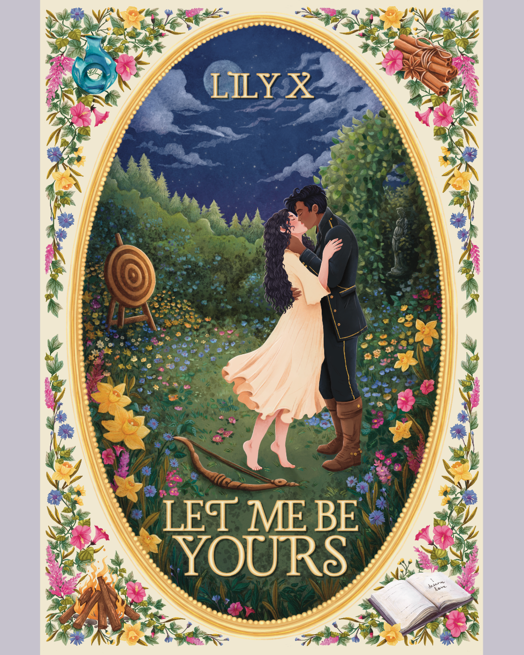

Book 4: Let Me Be Yours by Lily X.
Creative Direction: For Let Me Be Yours, the design embraces themes of devotion, belonging, and enduring love. A moonlit garden scene serves as the visual centerpiece, creating a romantic atmosphere through deep midnight blues, soft creams, and vibrant botanical details. Floral motifs and symbolic objects are woven throughout the established frame, continuing the series' visual language while introducing a more whimsical and storybook-inspired aesthetic.
Illustrated elements drawn directly from the novel expand the narrative symbolism across the dust jacket, foil case, endpapers, and sprayed edges, creating a cohesive collector's edition that feels both immersive and deeply personal to the story.
Highlights
Introduced a romantic, moonlit garden setting that expands the series' environmental storytelling.
Incorporated symbolic story elements throughout the artwork to strengthen narrative connection and visual cohesion.
Extended the collector experience through fully illustrated endpapers while maintaining continuity across the jacket, foil case, and sprayed edges.